How to style an interface using Tkinter
For this tutorial u need:
- Laptop with python installed and an editor
- a lot of patience
First u need a basic interface setup, u can make your own or copy mine just for testing.
Here is my code:
import tkinter as tk
from tkinter import ttk

class Application:
    def __init__(self, root):
        self.root = root
        self.root.title("Modern Tkinter Buttons")

        # Frame for the top-right corner
        self.right_top_frame = tk.Frame(self.root)
        self.right_top_frame.grid(row=0, column=0, padx=20, pady=20)

        # Setting up styles for buttons
        self.style = ttk.Style()

        # Use the 'alt' theme for a more modern look
        self.style.theme_use('alt')

        # Style for buttons
        self.style.configure("TButton",
                             padding=6,
                             relief="raised",  # Flat button for a more modern effect
                             background="#4CAF50",  # Nice green background color
                             foreground="white",  # White text
                             font=("Arial", 12, "bold"))

        # Hover effects for buttons
        self.style.map("TButton",
                       background=[("active", "#45a049")])  # Lighter green color when hovering

        # New style for the "Stop" button (red background)
        self.style.configure("RedButton.TButton",
                             padding=6,
                             relief="raised",  # Flat button without 3D effect
                             background="#FF5733",  # Red for the Stop button
                             foreground="white",  # White text
                             font=("Arial", 12, "bold"))

        # Hover effect for the "Stop" button
        self.style.map("RedButton.TButton",
                      background=[("active", "#FF2A00")])  # Darker red when hovering

        # Ensure that all columns have the same 'weight' so they scale evenly
        for col in range(4):
            self.right_top_frame.grid_columnconfigure(col, weight=1)

        # Ensure that the rows have the correct 'weight'
        self.right_top_frame.grid_rowconfigure(0, weight=1)
        self.right_top_frame.grid_rowconfigure(1, weight=1)
        self.right_top_frame.grid_rowconfigure(2, weight=1)

        # Buttons for Connect and Disconnect
        self.connect_button = ttk.Button(self.right_top_frame, text="Connect", command=self.connect)
        self.connect_button.grid(row=0, column=0, columnspan=2, padx=5, pady=5, sticky="ew")

        self.disconnect_button = ttk.Button(self.right_top_frame, text="Disconnect", command=self.disconnect)
        self.disconnect_button.grid(row=0, column=2, columnspan=2, padx=5, pady=5, sticky="ew")

        # Buttons for Start, Pause
        self.start_button = ttk.Button(self.right_top_frame, text="Start", command=self.start_process, state="disabled")
        self.start_button.grid(row=1, column=0, columnspan=2, padx=5, pady=5, sticky="ew")

        self.pause_button = ttk.Button(self.right_top_frame, text="Pause", command=self.pause_process, state="disabled")
        self.pause_button.grid(row=1, column=2, columnspan=2, padx=5, pady=5, sticky="ew")

        # Stop button (spanning 2 columns)
        self.stop_button = ttk.Button(self.right_top_frame, text="Stop", command=self.stop_process, state="disabled", style="RedButton.TButton")
        self.stop_button.grid(row=2, column=0, columnspan=4, padx=5, pady=5, sticky="ew")

    # Functions for buttons
    def connect(self):
        print("Connected")
        # Enable the Start, Pause, and Stop buttons
        self.start_button.config(state="normal")
        self.pause_button.config(state="normal")
        self.stop_button.config(state="normal")

    def disconnect(self):
        print("Disconnected")
        # Disable the buttons again
        self.start_button.config(state="disabled")
        self.pause_button.config(state="disabled")
        self.stop_button.config(state="disabled")

    def start_process(self):
        print("Process Started")

    def pause_process(self):
        print("Process Paused")

    def stop_process(self):
        print("Process Stopped")


# Main program
root = tk.Tk()
app = Application(root)
root.mainloop()
After running this code you see that you will get a nice interface that should look like this:
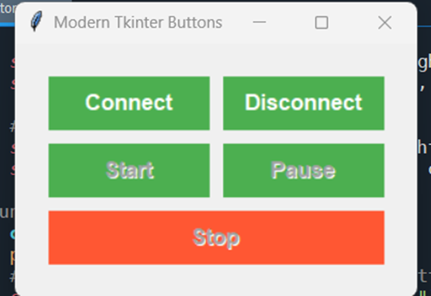
As you see I have a few basic buttons:
- connect and disconnect to connect to the robot
- start, pause, stop button to run some basic commands.
You can edit this to your command needs of course.
Now my code is a combination of all factors combined, but for learning purposes I will explain the pieces in bits. You can play around in these test codes to see what changing the values does, and what styling you like.
1. Creating a window
Before diving into styling, let’s first set up a basic Tkinter window:
import tkinter as tk

# Create a window
root = tk.Tk()
root.title("Styled Tkinter App")  # Set the window title
root.geometry("400x300")  # Set the window size

# Start the Tkinter main loop
root.mainloop()
As you can see here we already have done some styling by setting the window size.
2. Styling Widgets
Widgets in Tkinter can be customized using the config() method or by specifying options when creating the widget. Common style options for widgets include background color, foreground color (text color), font, border width, and padding.
2.1 Background and Foreground Colors
You can change the background color of a widget using the bg or background option and the text color using the fg or foreground option.
Example: Button with custom colors:
• bg="blue": Sets the background color of the button to blue.
• fg="white": Sets the text color to white.
import tkinter as tk

root = tk.Tk()

# Create a button with custom colors
button = tk.Button(root, text="Click Me", bg="blue", fg="white")
button.pack(pady=20)

root.mainloop()
2.2 Fonts
Tkinter allows you to customize the font style, size, and weight of text in widgets.
Example: Label with a custom font:
font=("Helvetica", 16, "bold") : Sets the font to Helvetica, size 16, and bold.
import tkinter as tk

root = tk.Tk()

# Create a label with a custom font
label = tk.Label(root, text="Hello, Tkinter!", font=("Helvetica", 16, "bold"))
label.pack(pady=20)

root.mainloop()
2.3 Padding and Spacing
Padding adds space around the content inside a widget. It can be set using padx, pady, ipadx, and ipady for horizontal and vertical padding inside and outside the widget.
Example: Entry widget with padding:
•	relief="raised": Adds a raised appearance to the button.
•	borderwidth=5: Sets the border width to 5 pixels.

import tkinter as tk

root = tk.Tk()

# Create a button with a raised border
button = tk.Button(root, text="Click Me", relief="raised", borderwidth=5)
button.pack(pady=20)

root.mainloop()
- Using the ttk Module for Modern Styling
Tkinter also provides the ttk (themed Tkinter) module for more modern-looking widgets with better styling options. ttk allows for enhanced control over the appearance of widgets, including theming support and more aesthetic options.
3.1 Creating Themed Widgets
ttk widgets automatically have more polished looks and support theming, which is absent from basic Tkinter widgets.
import tkinter as tk
from tkinter import ttk

root = tk.Tk()

# Create a styled button using ttk
button = ttk.Button(root, text="Styled Button")
button.pack(pady=20)

root.mainloop()
3.2 Changing Themes
You can apply themes to ttk widgets for a more modern interface. Tkinter supports various themes like "clam", "alt","classic", "default", and more.
Example: Applying a theme to the window:
style.theme_use("clam"): Sets the current theme to "clam". You can experiment with other themes by changing the argument.
import tkinter as tk
from tkinter import ttk

root = tk.Tk()

# Set a theme for ttk widgets
style = ttk.Style()
style.theme_use("clam")

# Create a themed button
button = ttk.Button(root, text="Styled Button")
button.pack(pady=20)

root.mainloop()
4. Advanced Styling with ttk.Style
For more control over the appearance of ttk widgets, you can customize individual widget styles using ttk.Style(). For example, you can change the appearance of a Button or Label globally.
4.1 Creating Custom Styles for Widgets
style.configure("TButton", ...): This customizes the appearance of all TButton widgets.
The TButton style affects only the themed buttons created using ttk.Button.
import tkinter as tk
from tkinter import ttk

root = tk.Tk()

# Create a Style object
style = ttk.Style()

# Customize the style for the Button widget
style.configure("TButton", font=("Verdana", 12), background="green", foreground="white")

# Create a button with the custom style
button = ttk.Button(root, text="Styled Button", style="TButton")
button.pack(pady=20)

root.mainloop()
5. Summary of Key Styling Options
Here’s a quick reference for common styling options in Tkinter:
| Column 1 | Column 2 | Column 3 | Column 4 |
|---|---|---|---|
| Option | Description | Example | |
bg or background |
Set the background color of the widget | bg=blue |
|
fg or foreground |
Set the text color | fg=white |
|
font |
Define the font type, size, and style | font=(Arial, 12, bold) |
|
padx, pady |
Set the horizontal and vertical padding | padx=20, pady=10 |
|
borderwidth |
Set the border width of the widget | borderwidth=5 |
|
relief |
Set the relief style (flat, raised, etc.) | relief=raised |
|
style |
Apply a custom style to ttk widgets | style=TButton |
|
theme_use() |
Change the theme for ttk widgets | style.theme_use(clam) |
For options in colors I used the website: HTML Color Picker
Here you can choose your color and then copy the hex id code.
For additional information of Tkinter use: https://tkdocs.com/
Here you can find more examples and documentation for Tkinter.
For extra theme styles available check out this website: List of ttk Themes
6. Conclusion
Styling your Tkinter interface can greatly enhance the user experience. By adjusting colors, fonts, padding, borders, and more, you can create professional and visually appealing GUIs. You can also leverage the ttk module for modern-themed widgets that provide better styling options out-of-the-box.
Experiment with different styles and themes to find the best look for your application.
I hope this How To was of interest to you. If you have any questions you can reply to this topic.
Good luck with building your interface!